Hello guys!
I have talked about how to mix prints several times in the past few years. Today I wanted to do a round up of my top 4 tips for doing so. Here they are:
Make one of the pieces the focus point.
Making one of the pieces you are wearing the focus point, will help you narrow down the colors you want to play with. It will also help you create a coherent look.
When wearing stripes, choose stripes in a neutral color.
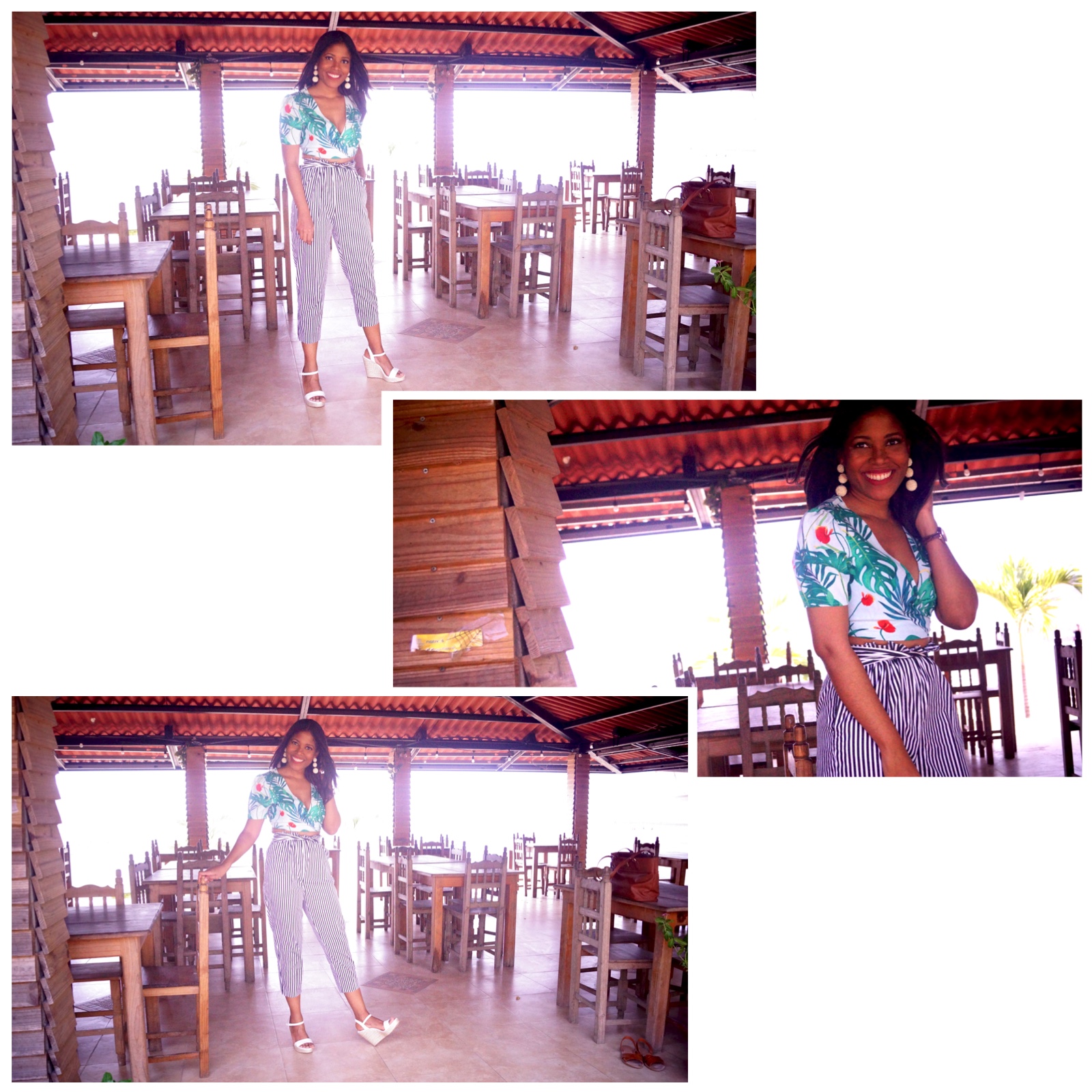
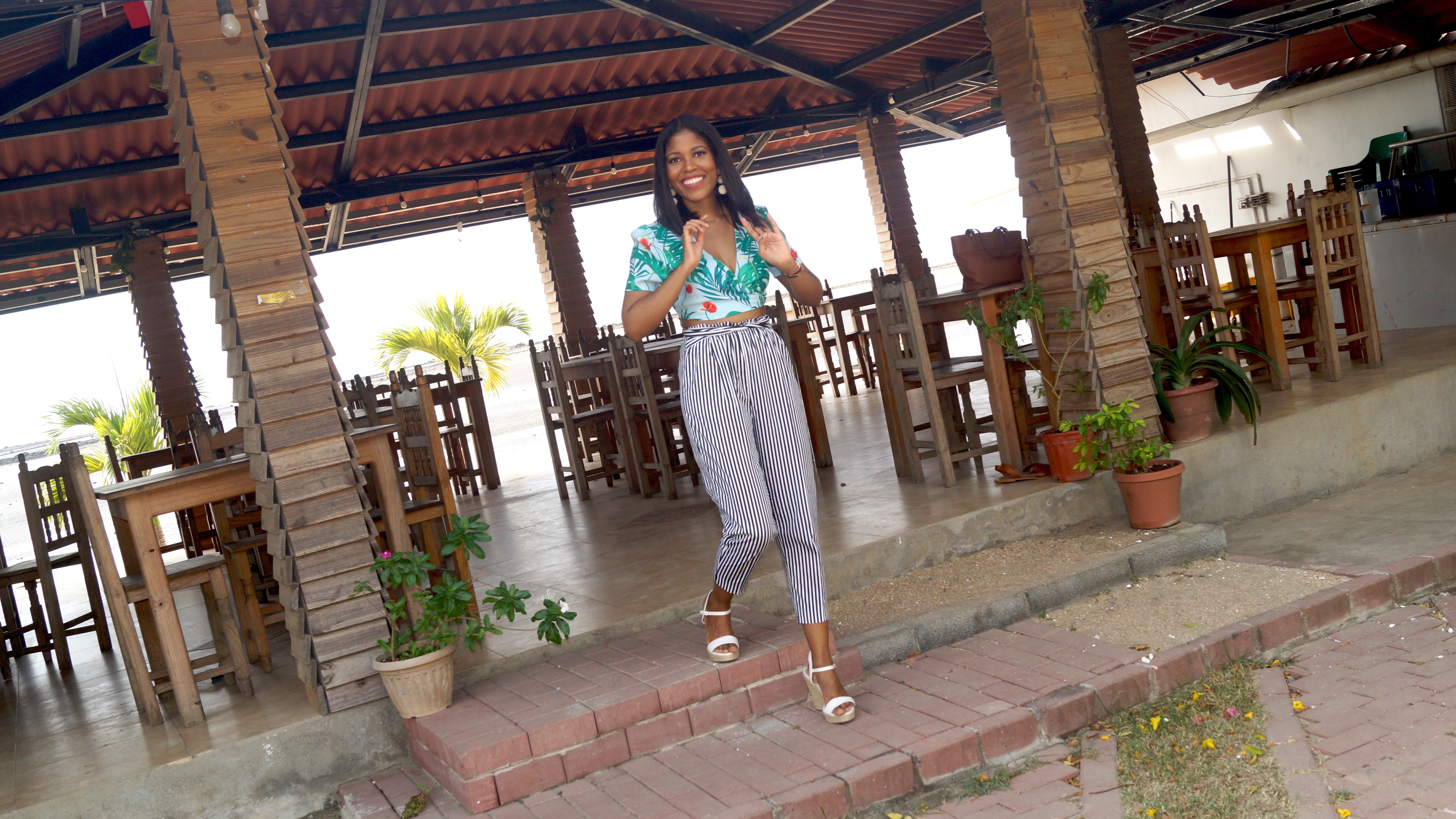
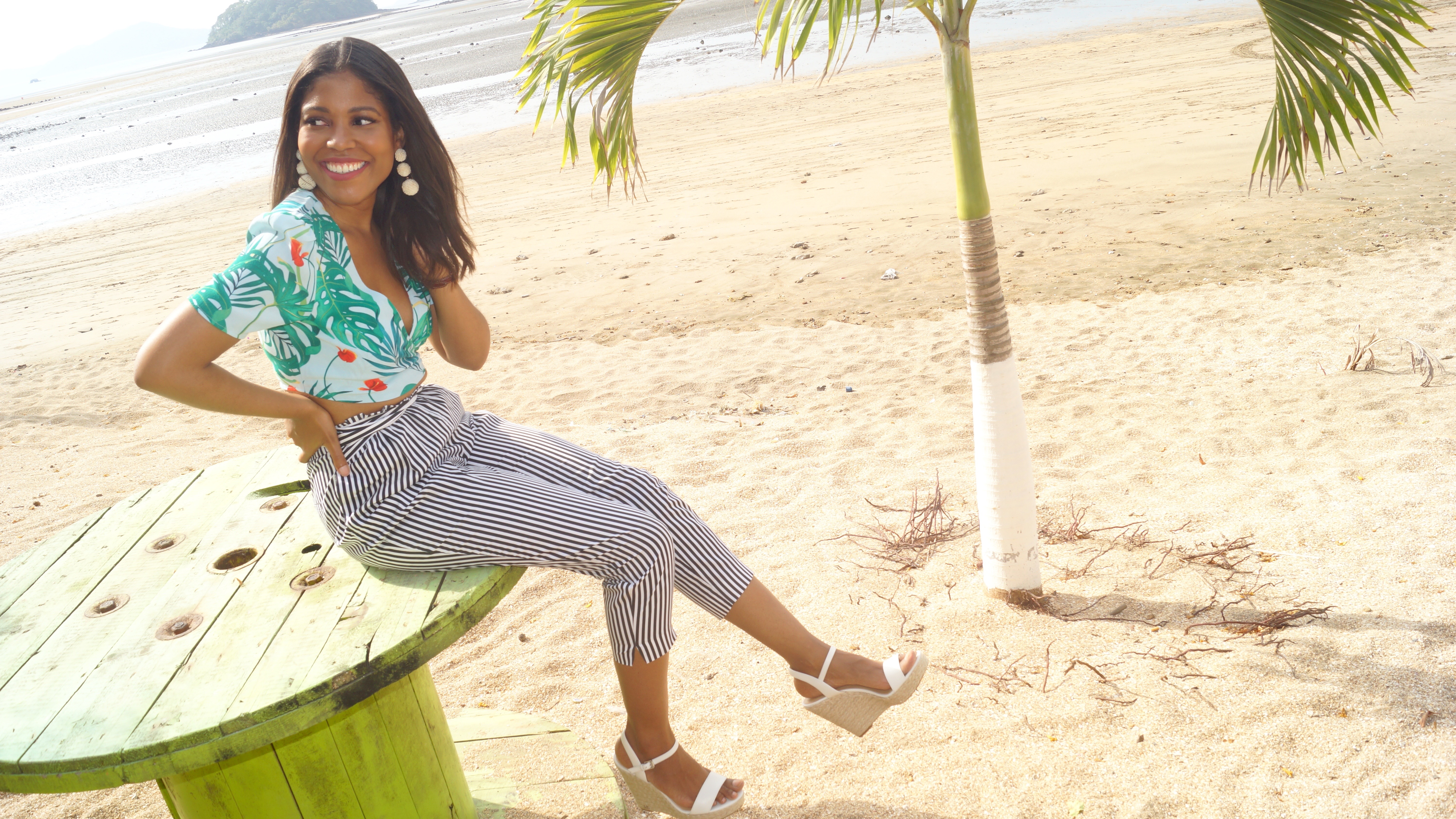
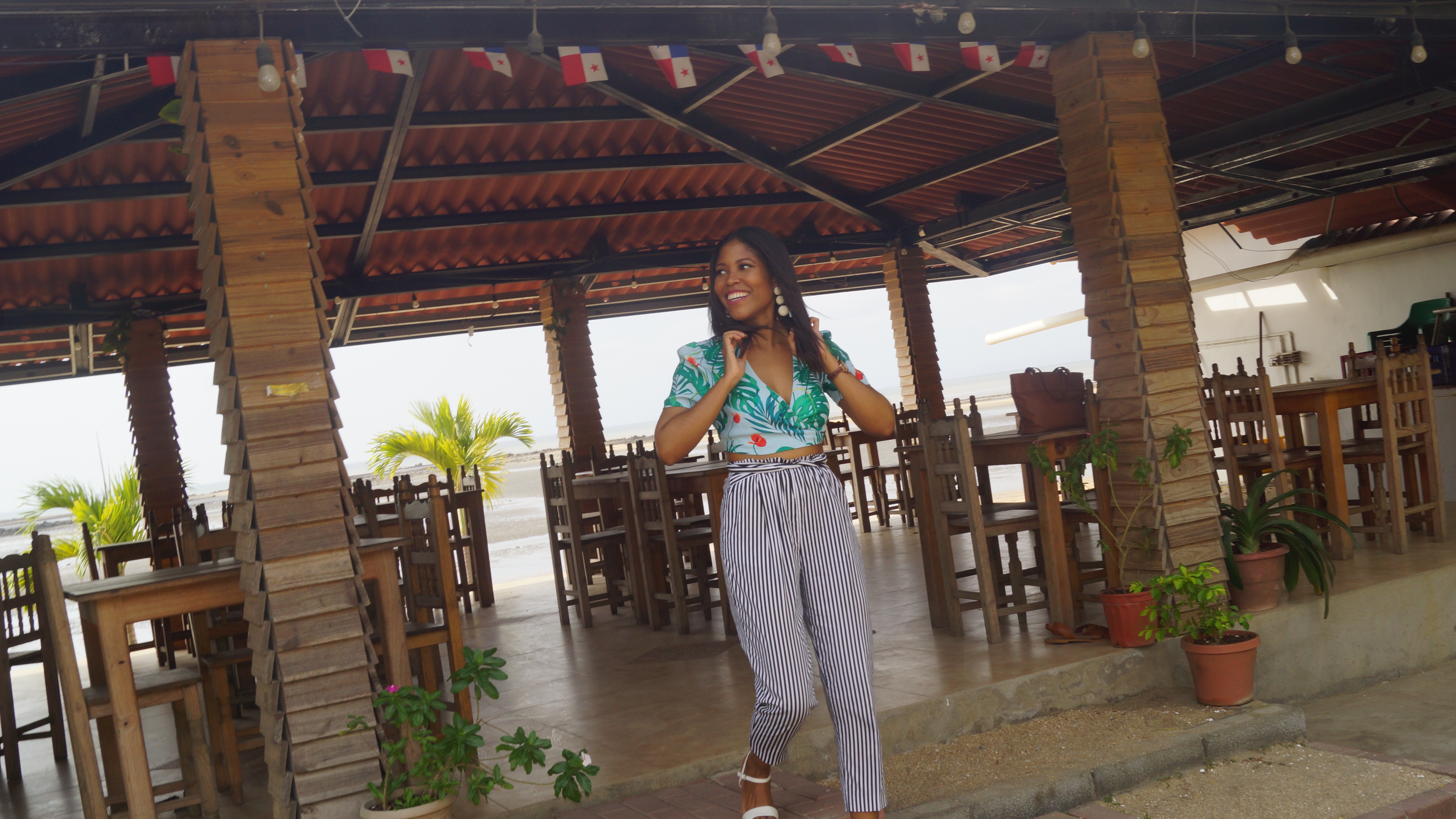
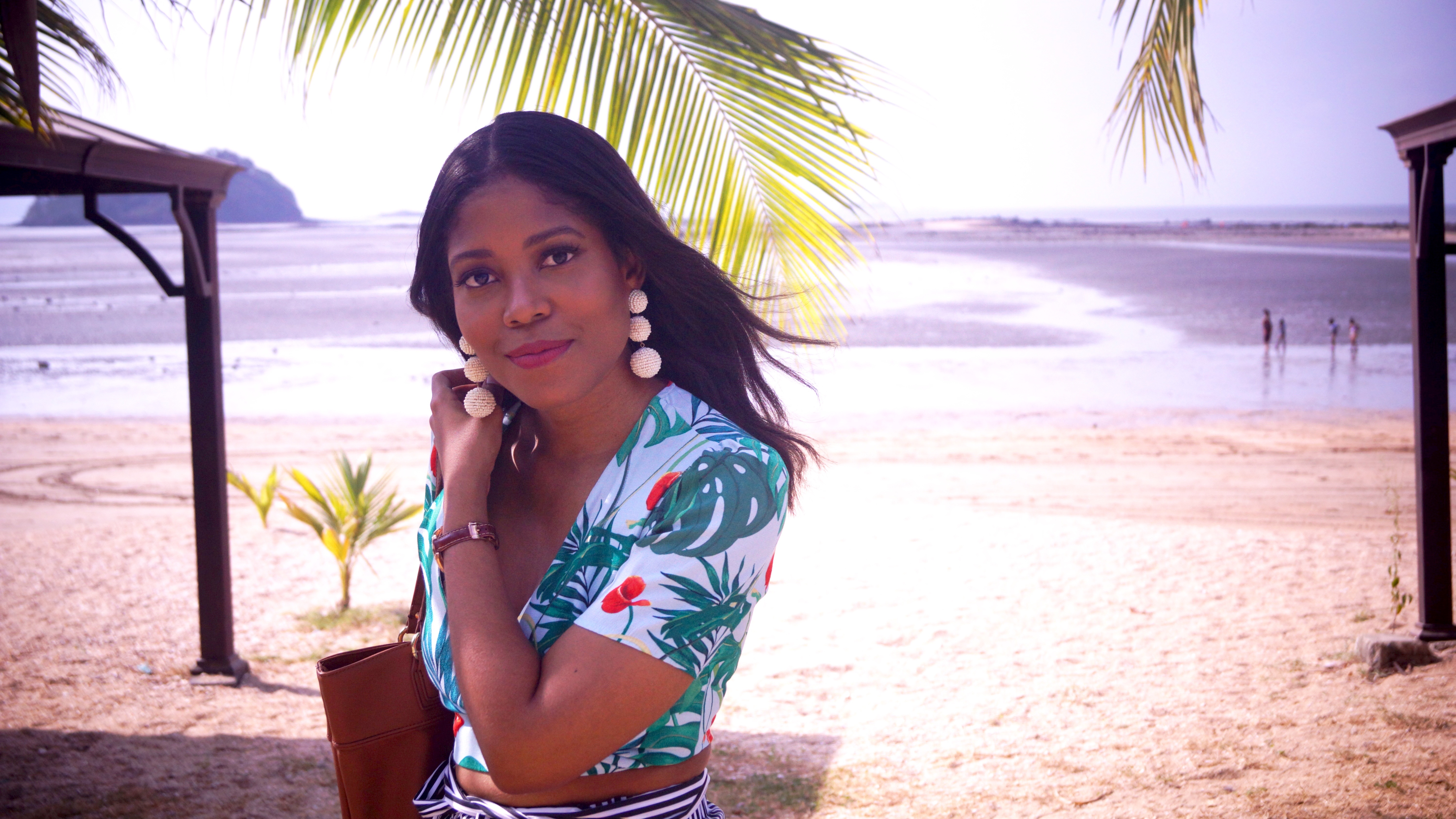
If you are scared of messing it up, go for stripes in a neutral color on the bottom or top. For example, here I went for pants with black and white stripes. This allowed me to wear a second piece with a bold print.
Make sure one of the prints is minimalistic.
As you can see the stripes on my pants are very thin. Your eyes are mostly drawn to the top instead of the bottom. Despite being a bold outfit the minimal print on the bottom make it safe. This is a good way to avoid both items from clashing.
Keep it in the same color family.
When playing with color, another helpful tip is to keep it in the same color family. This is an easy way you can play with different prints without having to worry about them clashing
In conclusion, these are my favorite tips to mix prints. Do you mix prints? What are your favorite combinations to create?
Lots of love,
Natalie
S.
¡Hola chicos!
He hablado sobre cómo mezclar estampados en diversas ocasiones los últimos años. Hoy quería hacer un resumen de mis 4 mejores consejos para hacerlo. Aquí están:
Haz de una de las piezas el punto de enfoque.
Hacer una de las piezas que está usando el punto de enfoque, te ayudará a elegir los colores con los que deseas jugar. También te ayudará a crear un look coherente.
Cuando uses rayas, elige rayas en un color neutro.
Si tienes miedo de estropearlo, usa rayas de un color neutro en la parte inferior o superior. Por ejemplo, aquí elegí pantalones con rayas blancas y negras. Esto me permitió llevar una segunda pieza con un estampado mas llamativo.
Asegúrate de que uno de los estampados sea minimalista.
Como puedes ver, las rayas en mis pantalones son muy finas. Tu mirada se va hacia el top en lugar del pantalón. A pesar de ser un atuendo atrevido, el estampado sencillo del pantalón lo hace llevadero. Esta es una buena manera de evitar que los dos elementos choquen.
Mantenlo en la misma familia de colores.
Al jugar con el color, otro consejo útil es mantenerlo en la misma familia de colores. Esta es una forma fácil de jugar con diferentes estampados sin tener que preocuparse de que estos choquen.
Aquí están mis consejos favoritos para mezclar estampados. ¿Mezclas estampados? ¿Cuáles son tus combinaciones favoritas?
Hasta la próxima,
Natalie S.
Photos/Fotos • Isaac Maestre
Se ve muy linda . Muy inesperada la combinación pero va con lo que mencionas arriba, es una fórmula-
Gracias! Y así es, es una formula
A mi se me complica un poco combinar prints pero lo pondré en práctica y te etiqueto a ver que tal
Me parece genial!